client
Four Seasons Hotel Hampshire
ask
To design a visual platform that will encapsulate the property's distinctive countryside charm, and bring cohesiveness to all digital and printed communications to ensure an engaging Four Seasons brand experience.
scope
Branding & Graphic Design
solution
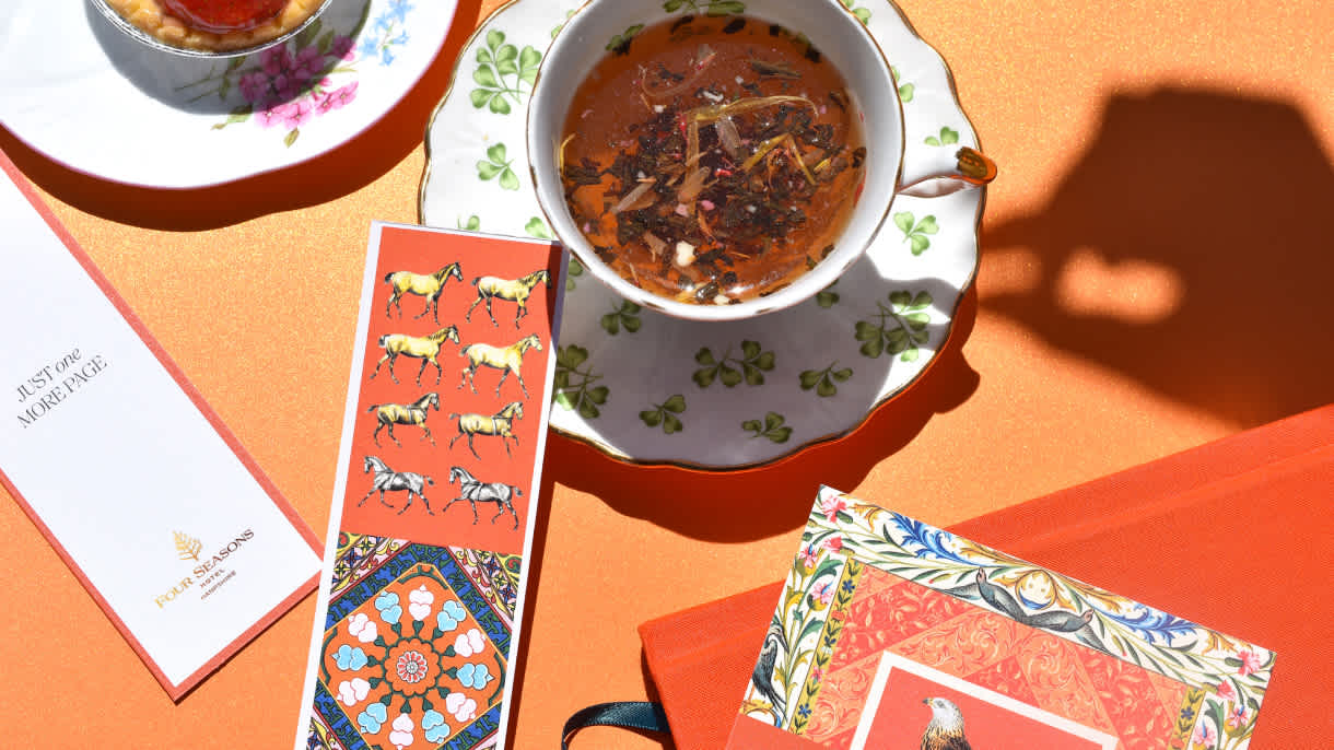
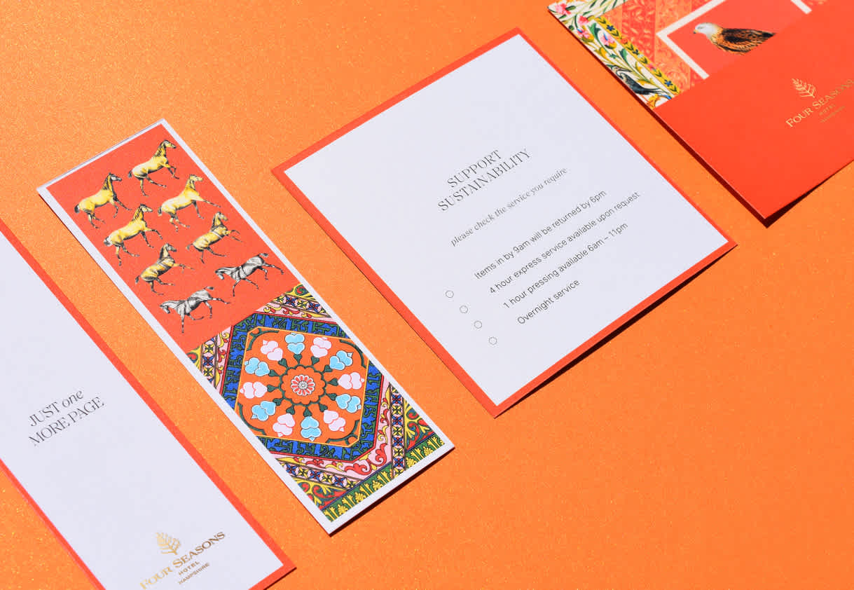
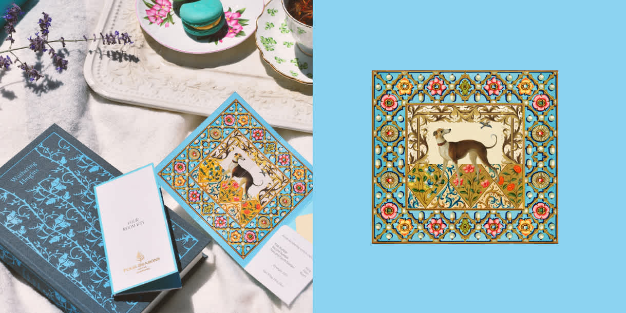
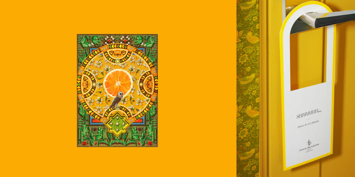
In redesigning this Four Seasons Hotels and Resorts experience, our vision was to bring the 18th-century manor to the forefront. This endeavor began with the creation of a custom collection of illustrations, each thoughtfully designed to capture the essence of the hotel's sprawling 500-acre estate. Our design strategy embraced a lavish, maximalist style that was rich in detail; while simultaneously infusing elements of minimalism to create a duality that balanced opulence with understated elegance. This approach artfully spotlighted what the property has always been celebrated for – a blend of historical elegance and modern luxury service.
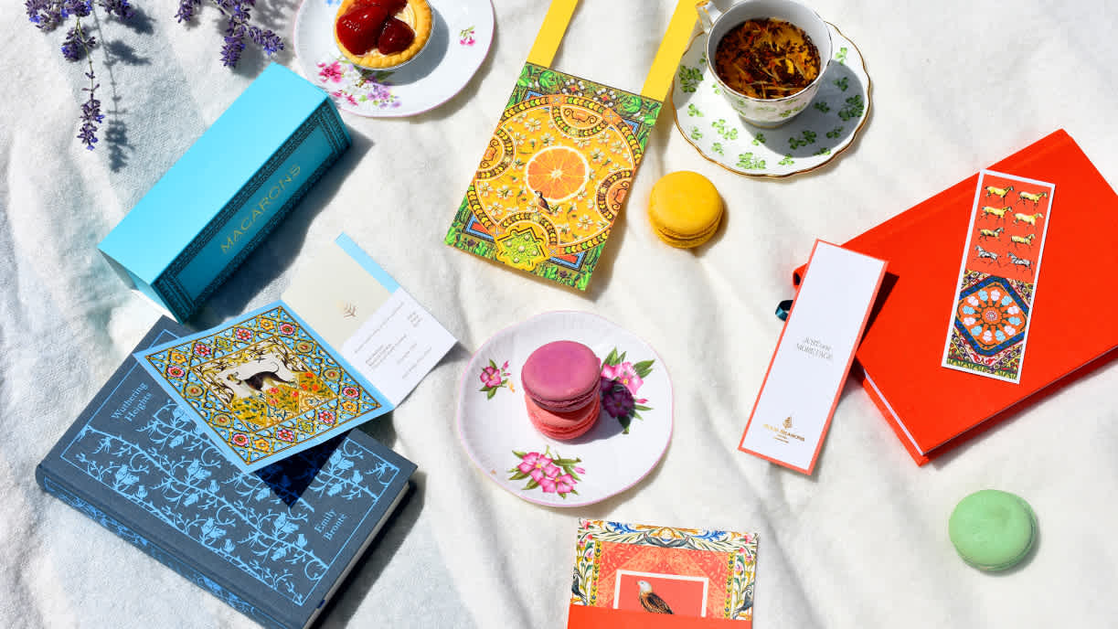
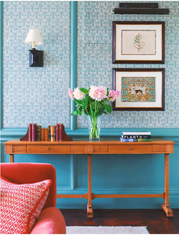
Inspired by the elegance of heritage brands such as Hermès and Holland & Holland, the visual platform drew heavily from the hotel's intricate interiors and the equestrian themes.
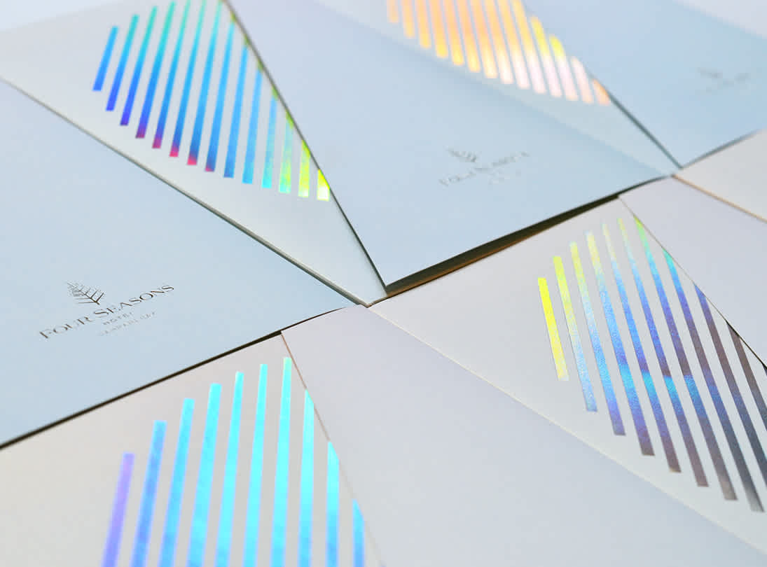
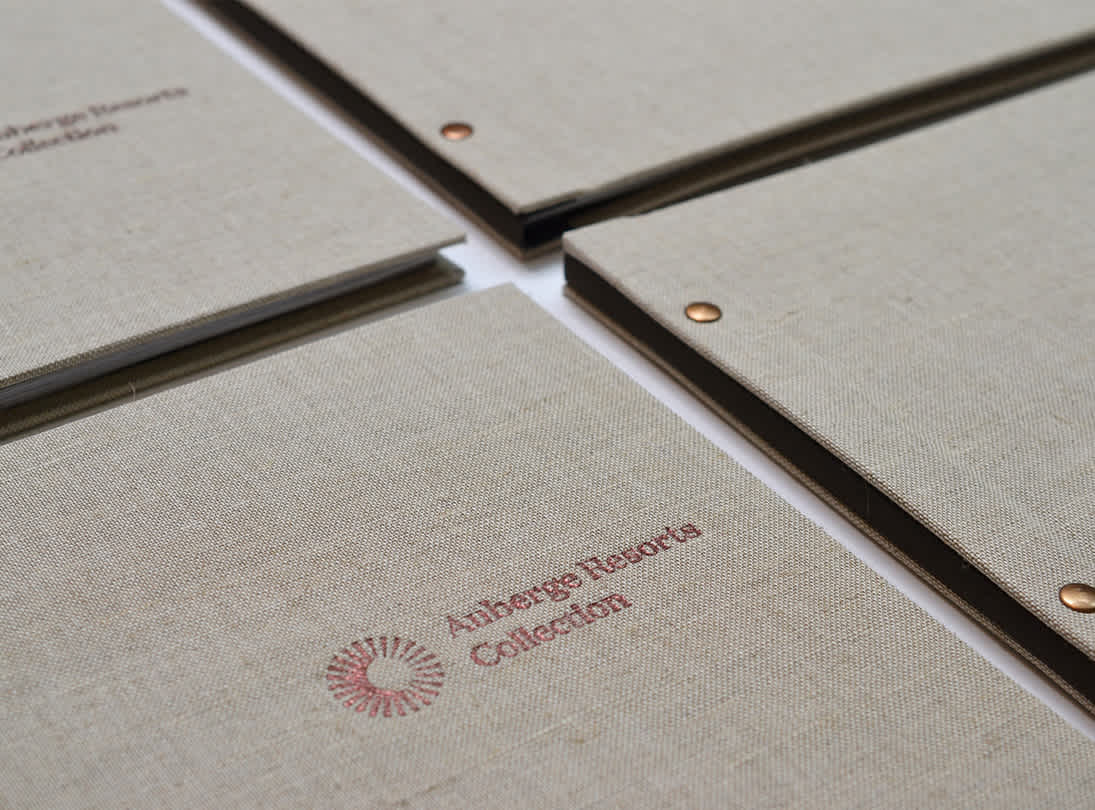
The rejuvenated visual platform achieved a seamless integration across all guest touchpoints, immersing them in a narrative that was authentic to the Hotel experience. It not only redefined their collateral but also complemented the property's distinctively English interior design.
