client
Remora EQ Capital Investments
ask
To develop a brand identity and visual system for a capital firm that is focused on investing in companies with strong business fundamentals in Canada and the US.
scope
Branding and Visual System
solution
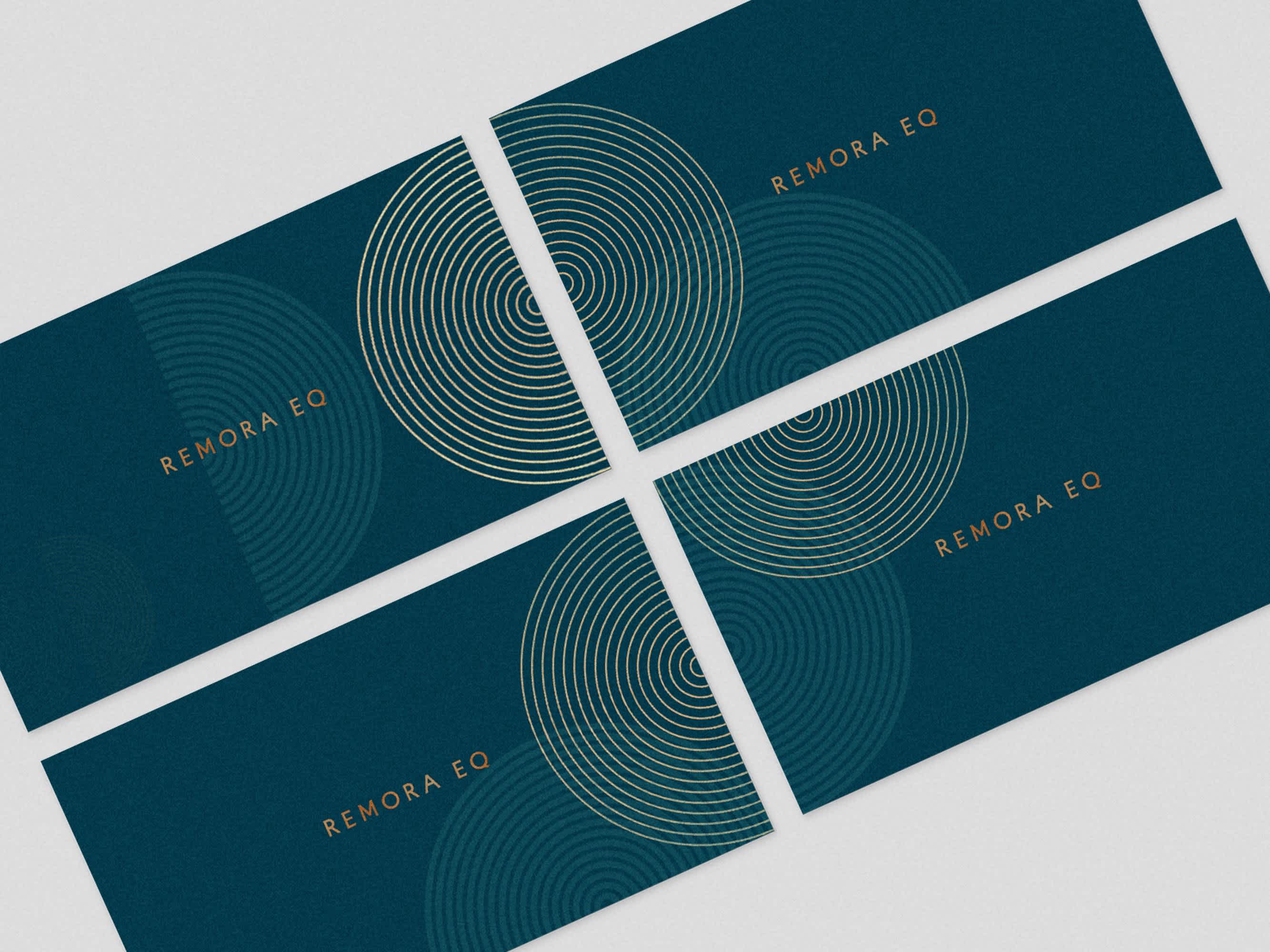
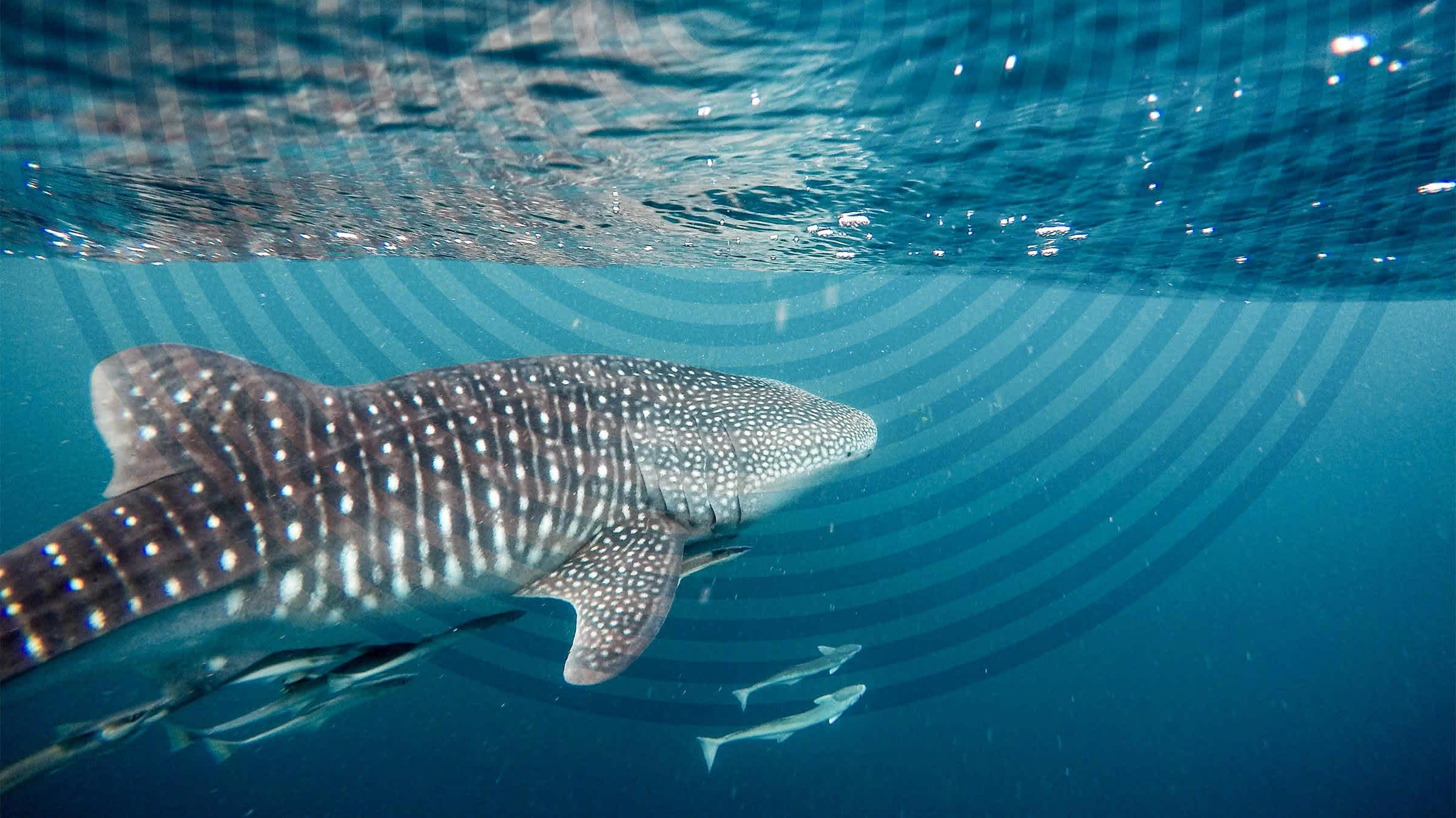
With a name identified, we leaned into ‘Remora EQ’ to develop a brand that reflected the name. Playing with evocative yet serene photography and elements of a dynamic logo, we designed a distinguished visual system to capture a private equity model that the company is building.
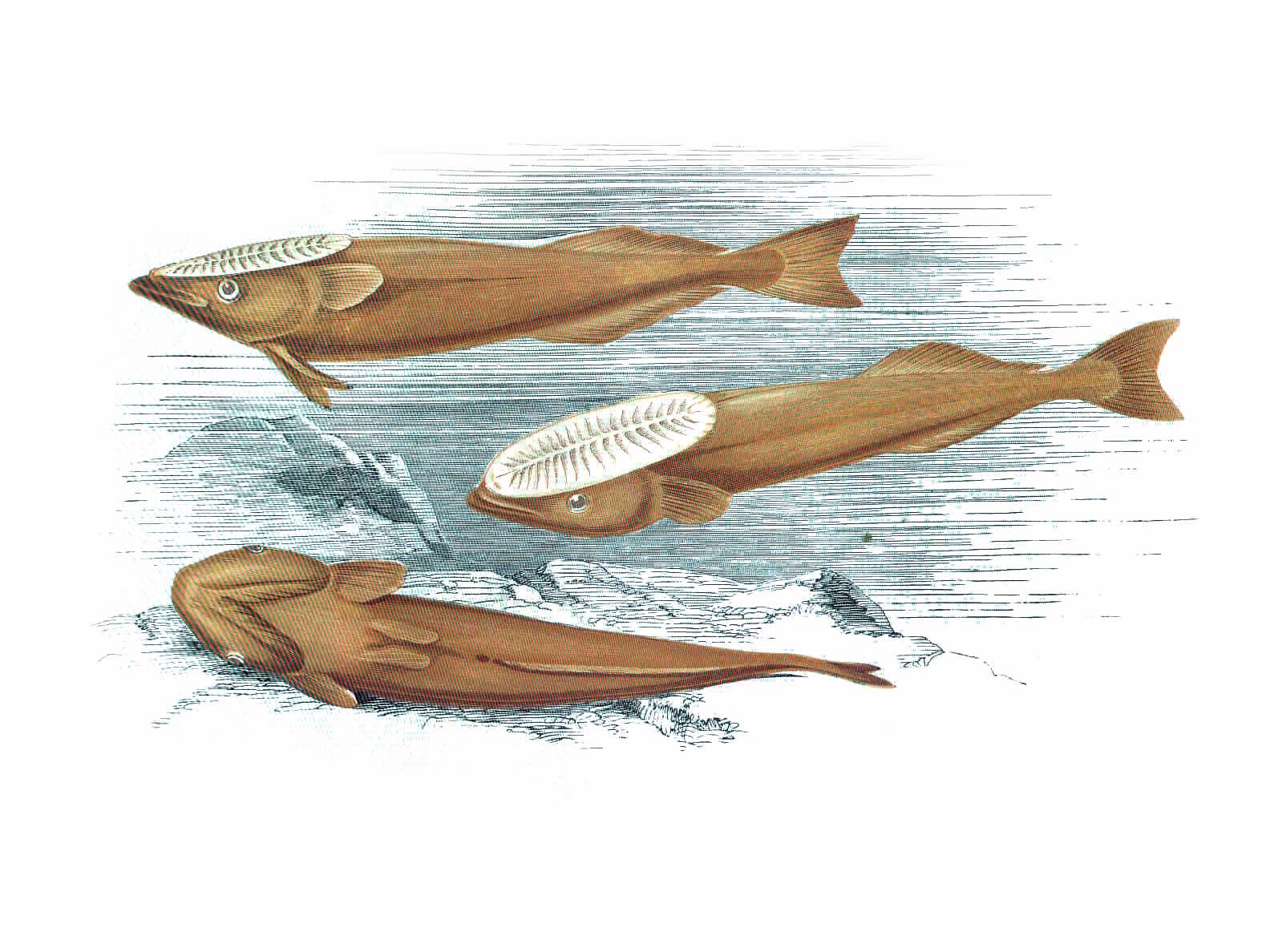
Named after the remora fish, Remora EQ mimics the symbiotic relationships between the shark and the fish to bring together investors, partners and portfolios of companies for mutual benefit. Our team distilled this to its simplest form, honing in on the calming balance found in nature as inspiration for our creative.

Clean visual elements and metaphorical photography allows the reader to focus on what matters most, THE CONTENT.

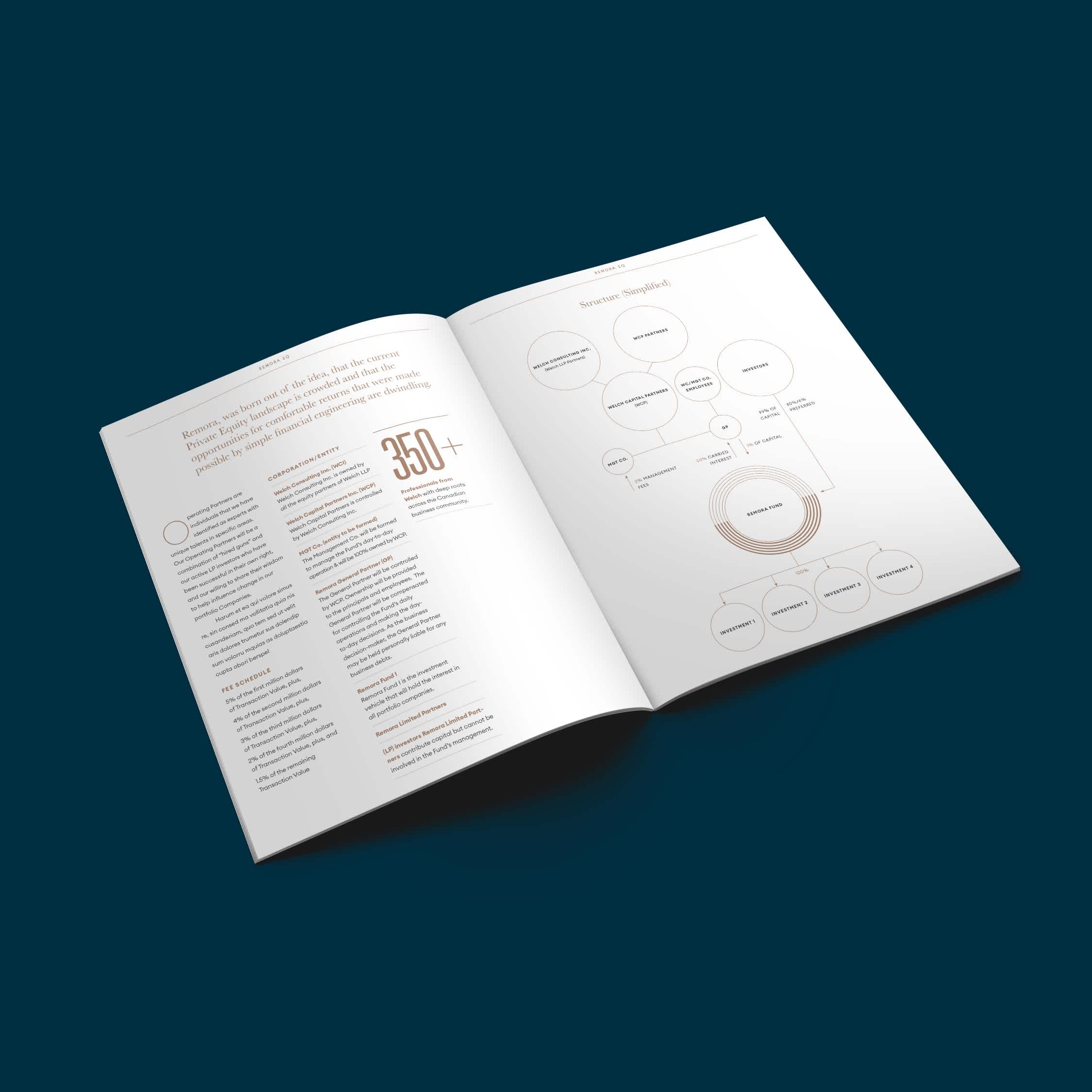
We know that financial content can sometimes be overwhelming. So to help make the information digestible and bring consistency across all collateral, we leveraged the logo developed to create a visual element that illustrates stats and data.
Our goal was to create a brand that stood out amongst the industry. We went against the traditional branding for this sector - throwing away images of crowded office buildings and bold colours. This resulted in refreshing designs for this new breed of Private Equity firm.


