client
High Tea Cannabis Co.
ask
To design a brand for a cannabis retailer in the Greater Toronto Area looking to influence the cannabis culture by curating a safe and uplifting retail experience.
scope
Logo, Branding and Visual Identity
solution
We knew the branding had to be bold, and establish a personality that was urban and avant-garde, yet welcoming. The unique wordplay of the name was the start to a clever and adaptive brand that took queues from the conscious connection that the social consumption of cannabis brought.
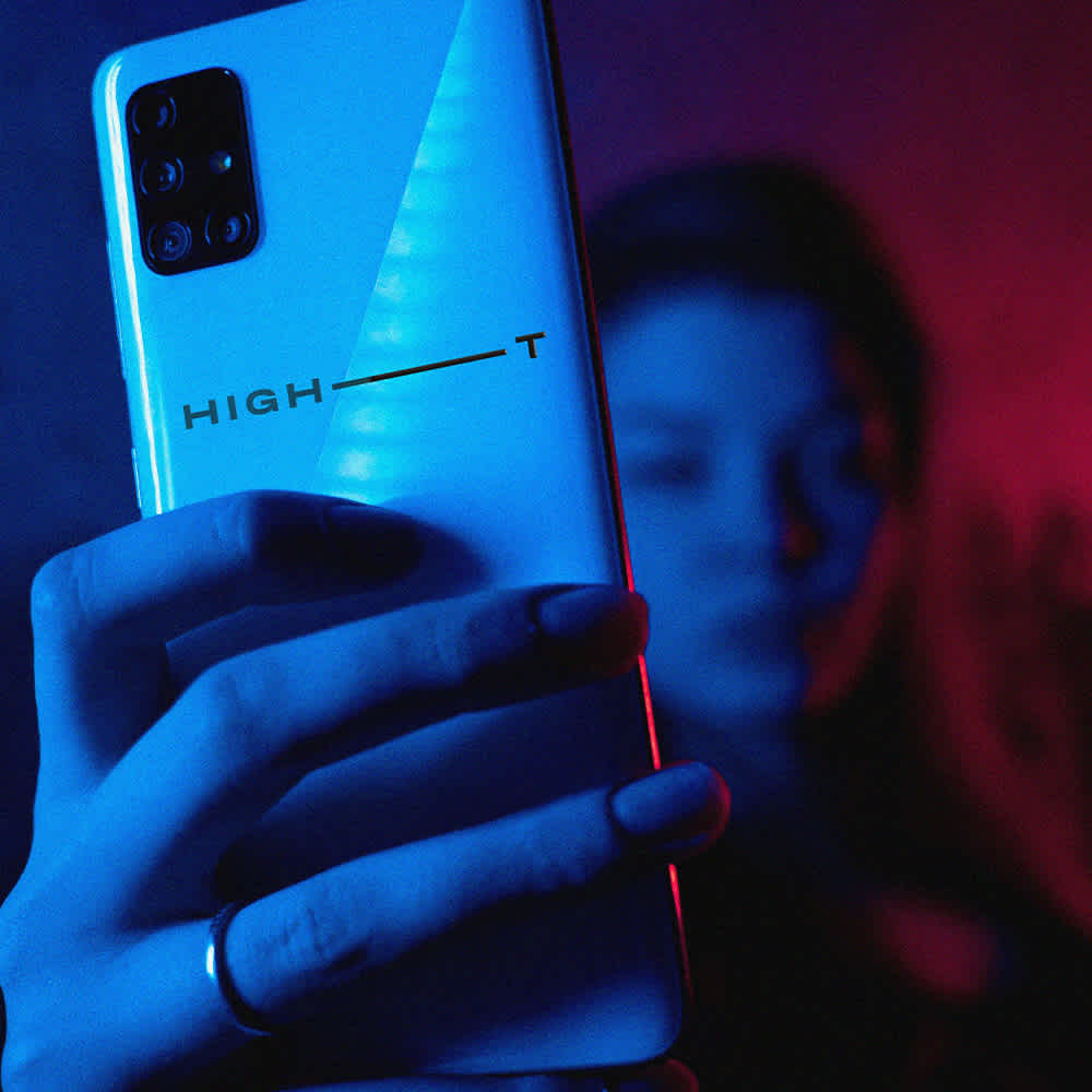
As curators and experts on cannabis culture, we sought to position High Tea Cannabis Co. as a portal to a wide array of consumption experiences. A strong word mark with a tension point that played off the simplification of the long form "Tea" was developed. This extended into the visual language, where a metaphor of the eye was introduced - the physiological response of the pupils that is uniquely personal H(eye) T. This would would become the visual language to help consumers navigate the retail experience, setting them apart as experts in the industry.
The dilation of the pupils is a response
to the JOURNEY that you are on...
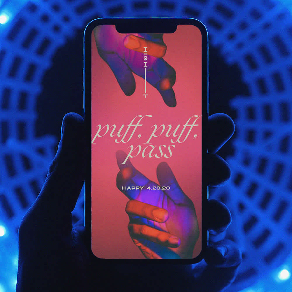
The brand was deliberately colourful. The palette included 4 primary and 8 secondary colours, all selected to pair well. This eventually influenced the low-light, high-saturated photography and visuals to reflect the attitude of the brand that was unmistakably edgy and boundary-pushing.
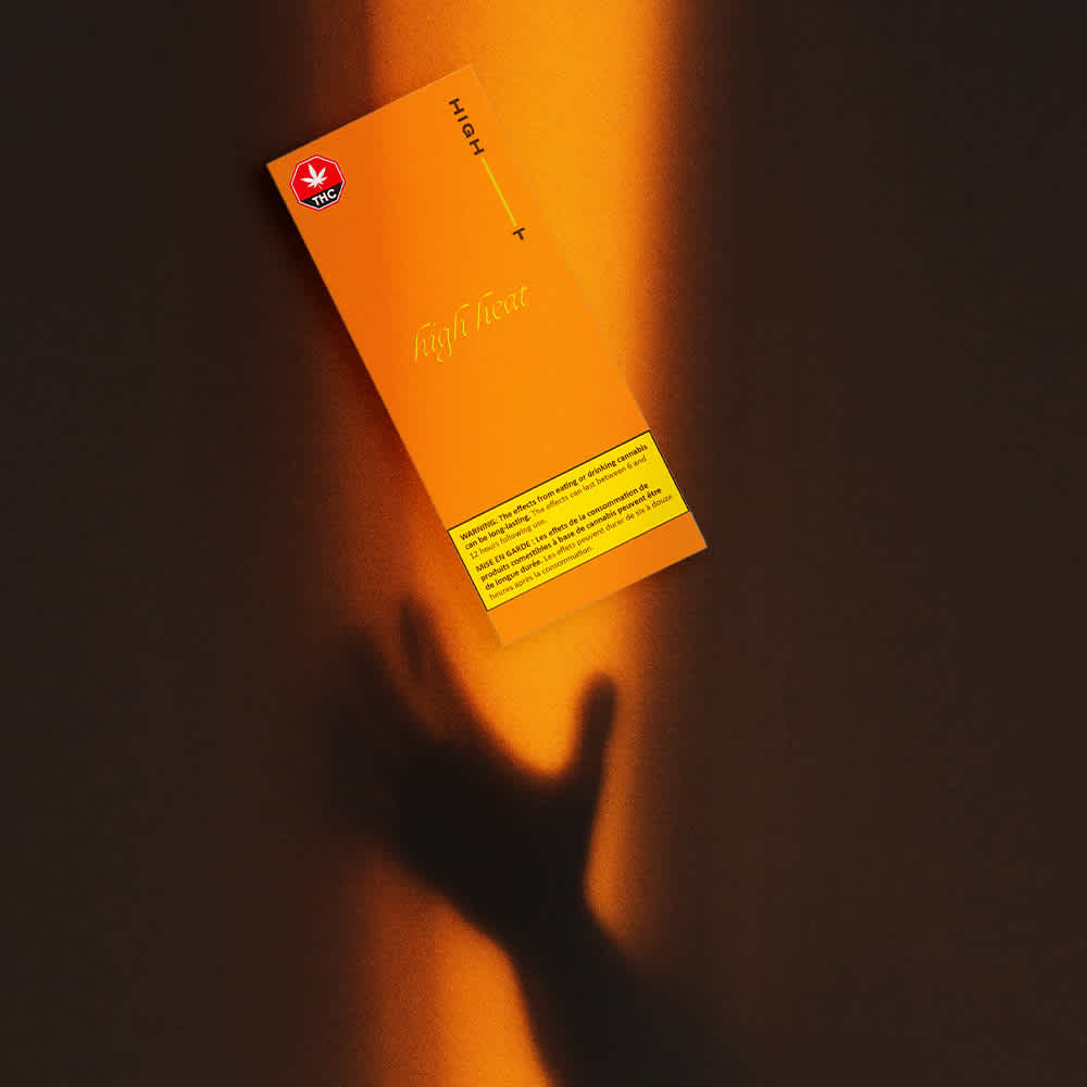
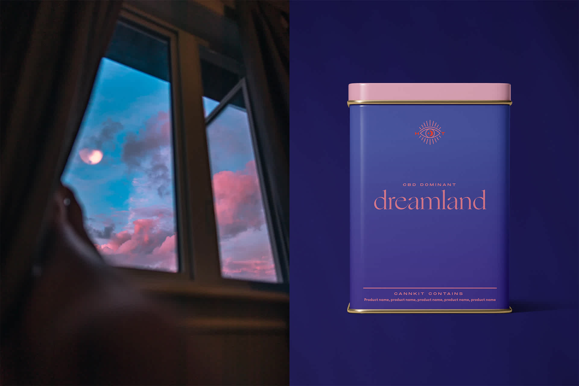
While there are endless options for products, the tea canisters presented an opportunity for High Tea to educate through curated products. With the help of the brand elements and the esoteric eye, the cans would immediately convey the consumption experience.
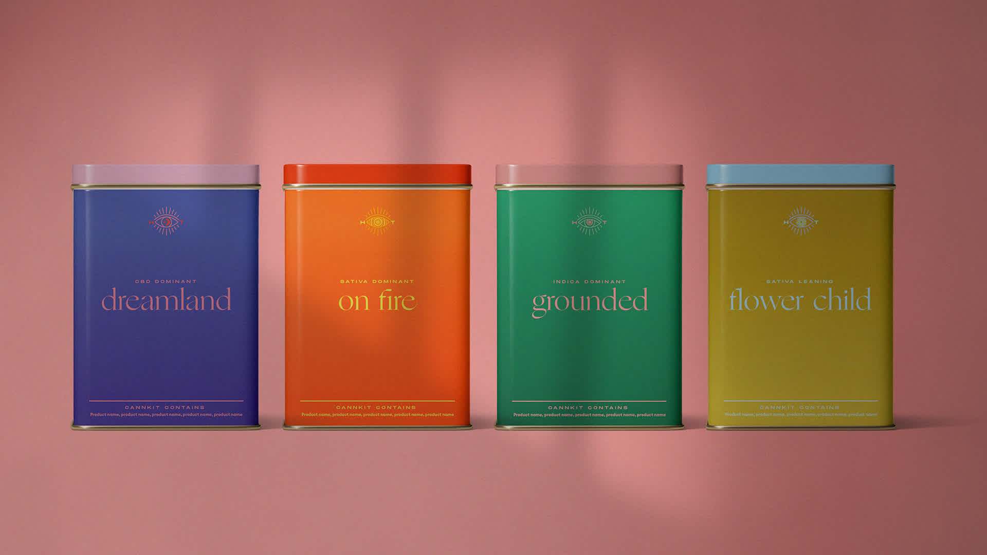
With the CORE ESSENCE OF THE BRAND developed,
it became the underpin for all future designs.
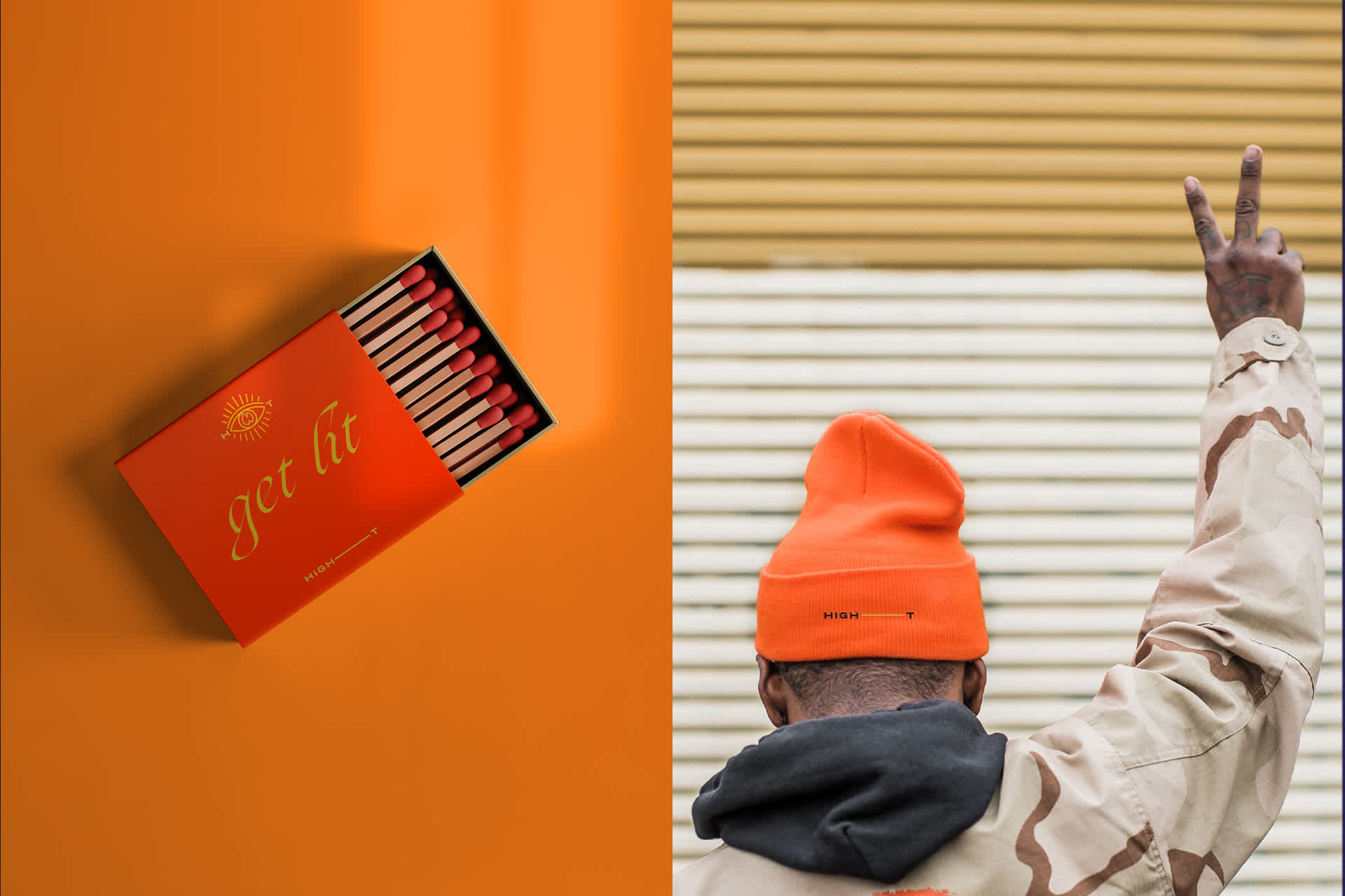
We started the journey with High Tea at the beginning - from the the brand positioning and investor decks to the creation of brand elements necessary for success. In an already saturated market, we wanted to equip the team with a model that would help them push the envelope in creating a safe space for new and experienced consumers to learn and share. While not all of our brand elements made it to the final brand roll-out, we've chosen to display some of our initial executions in this case study.

